You can explain your work perfectly and still watch it fade the moment the talk ends. Not because the research isn’t strong, but because the audience can’t see how the pieces fit together yet.
Research carries responsibility—not just to be right, but to be understood well enough to travel.
Most research communication isn’t failing on accuracy. It’s failing on orientation. There’s a lot to hold at once. Context. Assumptions. Methods. Implications. Even a motivated audience has limits.
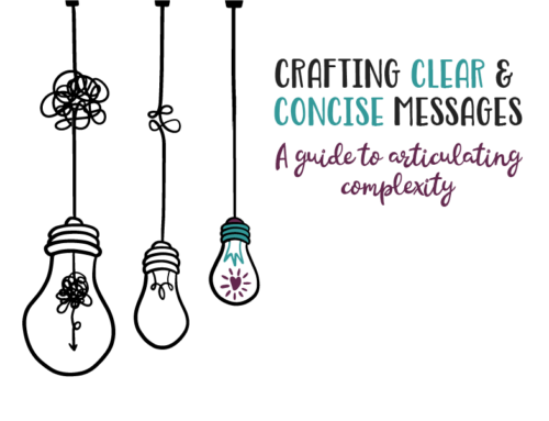
Here’s the shift that matters: clarity isn’t about simplifying the science. It’s about simplifying the path through it.
When complex ideas are made visual—processes, relationships, trade-offs—the audience doesn’t have to keep everything in working memory.
They can see the structure. They can follow the logic. They can stay with you.
The cost of confusion is quiet. When ideas don’t land, they don’t travel. They don’t influence decisions. They don’t earn the trust the work deserves.
The work doesn’t need more explanation. It needs a clearer shape. That’s what visual storytelling is really for. Not decoration. Orientation.
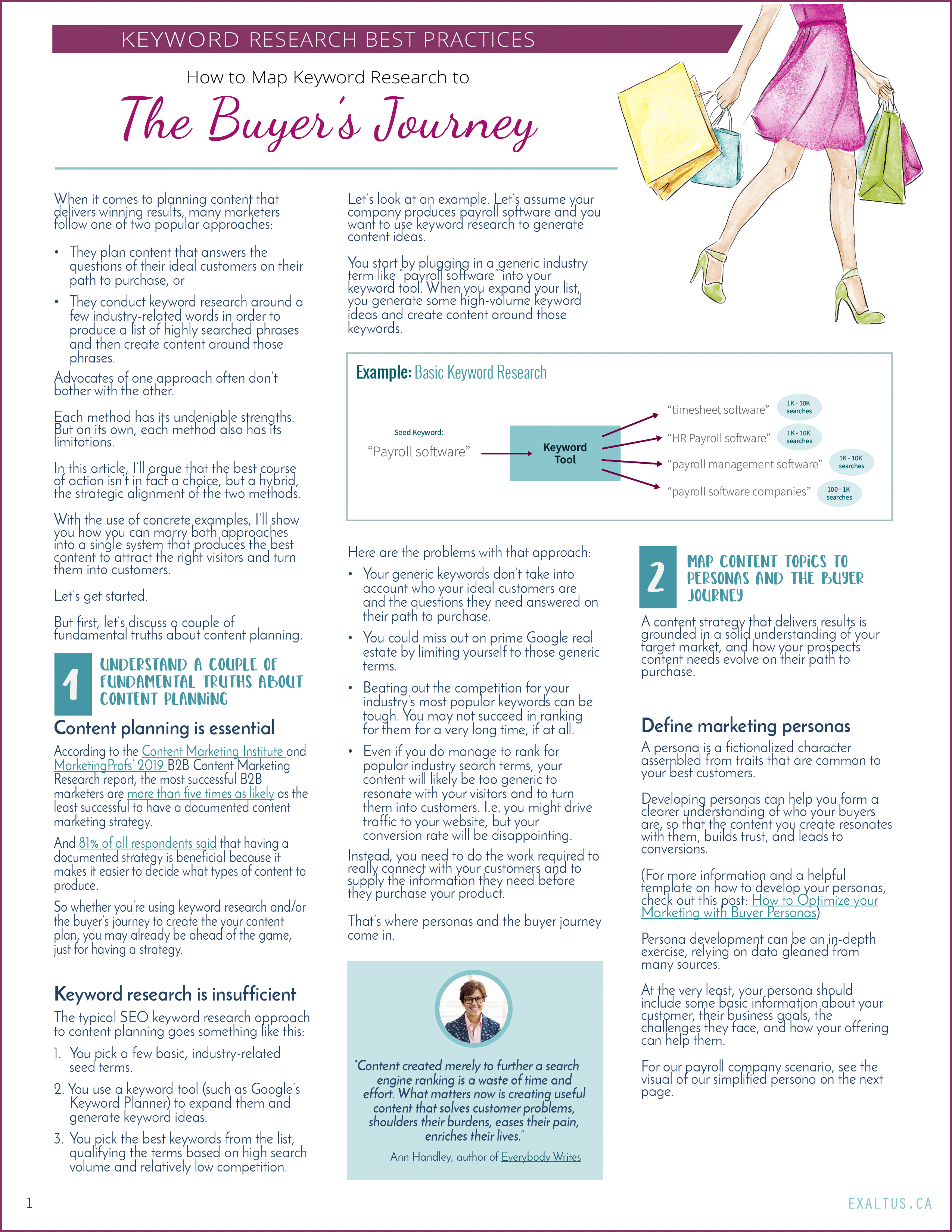
Why research often doesn’t travel
Most researchers are careful communicators. They choose words precisely. They hedge appropriately. They respect uncertainty. And still, a familiar frustration shows up: People listen. They nod. They ask surface-level questions.
Then the work seems to disappear.
This isn’t a failure of interest. It’s a failure of cognitive bandwidth. Every audience—no matter how engaged—is doing invisible work while listening. They’re trying to understand what matters⎯how ideas relate, where to focus, and what can safely be ignored.
When that work is left entirely to them, attention leaks away. Orientation is what tells the brain:
- This is where you are.
- This is how the pieces connect.
- This is why this matters.
Without it, even excellent ideas float untethered.
Explanation isn’t the same as orientation
Most research communication leans heavily on explanation. More background. More detail. More careful qualifiers.
Explanation adds information. Orientation reduces effort. That difference matters.

Imagine being handed a box of puzzle pieces. Every piece is important and well-made, but there’s no picture on the lid. You can still assemble the puzzle, but it will take longer, and many people will quietly give up.
Orientation is the picture on the box. It doesn’t remove complexity. It makes complexity navigable.

What audiences need to understand complex research
Even when they don’t say it, most audiences are silently asking the same questions:
- Where should I focus?
- What connects to what?
- What changed because of this work?
- Why does this matter now?
These aren’t requests for simplification. They’re requests for structure. When structure is missing, people default to what’s easiest to remember.
Often, that’s the most familiar idea, the loudest one, or the one that fits what they already believed.
That’s how careful work gets flattened: Not through opposition, but through overload.

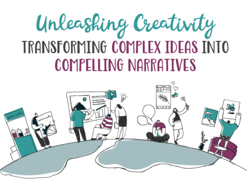
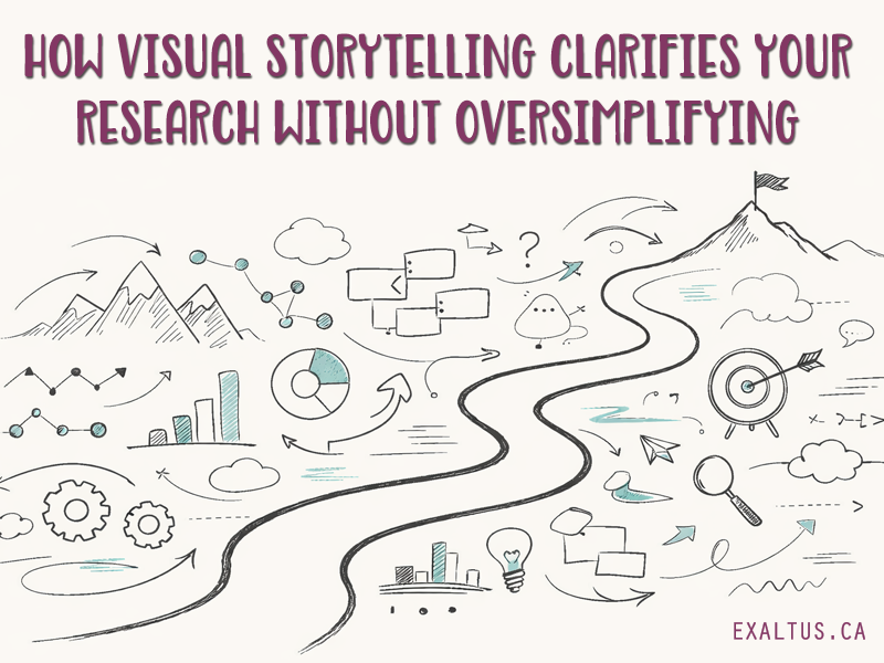
How visual storytelling supports research understanding
Visuals are often misunderstood. They’re treated as decoration or as something added at the end.
But at their best, visuals do something very specific: They externalize thinking. They take relationships that would otherwise live only in the researcher’s head
and make them visible.
A sequence becomes a path. A comparison becomes a spatial contrast. A decision point becomes a fork in the road.
The audience no longer has to imagine the structure because they can see it. And that frees up mental energy for understanding.
Visual clarity is not oversimplification
Simplifying the path is not the same as simplifying the content.
Good visual storytelling respects the audience’s intelligence and assumes they can handle nuance. It just doesn’t ask them to juggle everything at once.
Precision and uncertainty stay intact. What changes is the cognitive load. The work becomes easier to enter and to carry forward.
A better question for researchers to ask
Instead of asking,
“How do I explain this more clearly?”
Try asking,
“What does someone need to see first to understand the rest?”
That question changes everything. It shifts focus from coverage to coherence. From completeness to guidance. From telling to revealing.
Often, the answer isn’t more slides. It’s a different order, a clearer visual hierarchy, or a single image that anchors the whole story.
When research is understood, it starts to travel
When people can see the structure, something subtle happens. They begin to talk about the work accurately, ask better questions, and connect it to other decisions.
The research starts to move without you in the room, because it was understood.
That’s how trust forms: Quietly and through clarity.
Orientation is the quiet work behind research impact
Most research doesn’t fail because it’s too complex. It fails because it asks too much of working memory.
The solution isn’t simplification. It’s orientation: A clearer shape, a visible path, a way in.
If you’re struggling to make your work stick, the problem may not be what you’re saying. It may be that others can’t yet see how to hold it.
If you want to explore how visual storytelling can help clarify complex research without compromising accuracy, check out examples of our work , sign up to our newsletter, or get in touch to talk through a specific challenge.